16/11/20
GAM701
Today my team and I had a meeting with Matt to discuss our current project and how we were getting on. Although I did not intend to spend too much time working on the game today, as I wanted to prioritise my character work, I did do some concept sketches for the backgrounds. This was to give my team a clearer understanding of what a potential background could look like and to form a clearer idea in my head on how I will go about this.
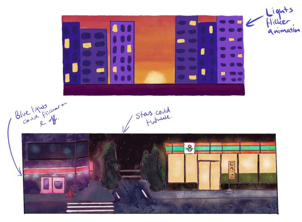
I quickly made these sketches in Procreate and based them off the environment moodboards I had made previously, as mentioned in previous posts.
Before moving onto any other work, I created my plan for this week.
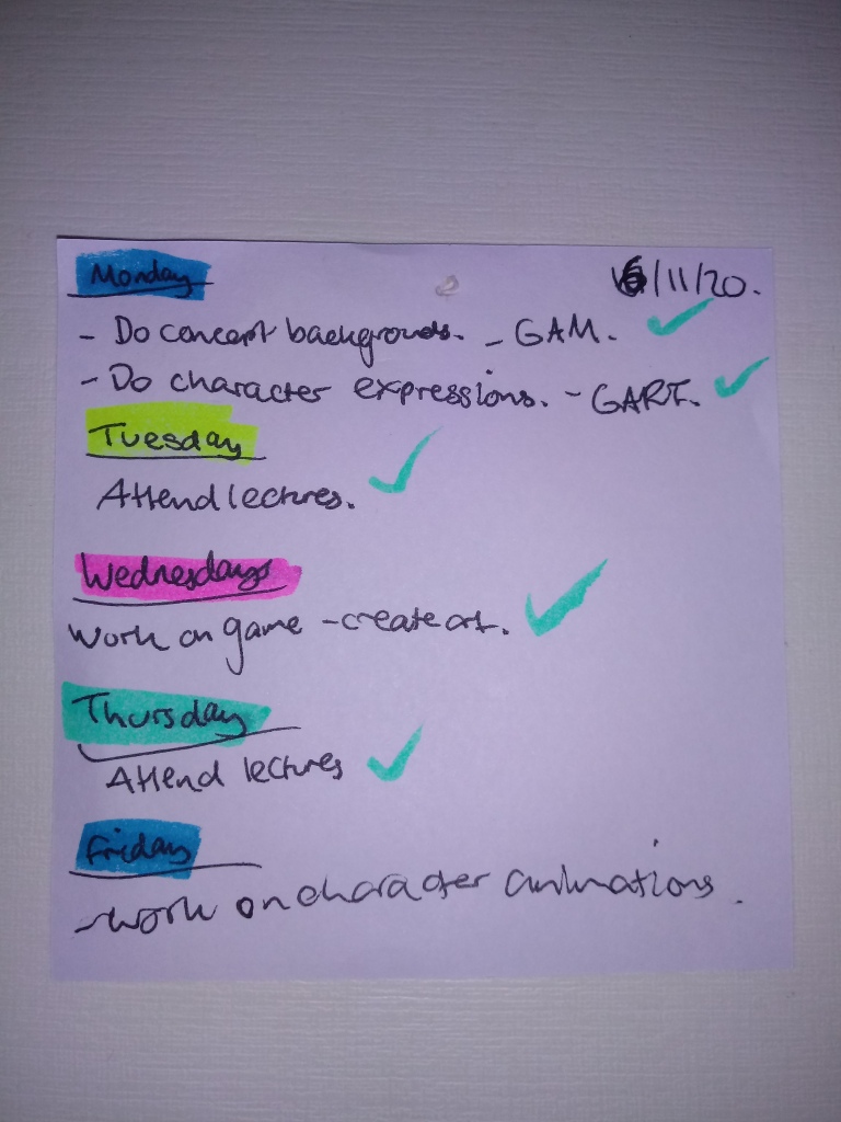
Transcribed version:
Monday: – Do concept backgrounds – GAM. – Do character expressions – GART.
Tuesday: – Attend lectures.
Wednesdays: Work on game – create art.
Thursday: – Attend lectures.
Friday: – Work on character animations.
GART702
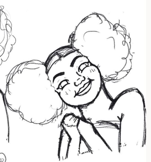
After this, I worked on my character’s expressions. I used the poses I had created to inform how to position the face. Before working on any of the exaggerated expressions, I first created a neutral face that I could base the rest on. I used the references that I had gathered and drawn over, as mentioned in my previous blog post. These helped me identify the key facial features I wanted to include, as well as similarities between Black facial features.
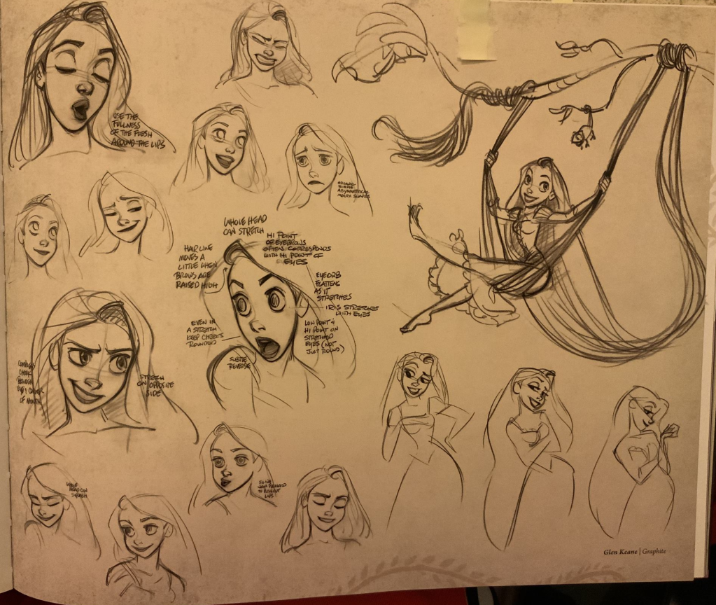
After creating a neutral face, I then moved on to creating the happy, sad and angry faces. For this, I got a lot of inspiration for the concept art of Spiderman: Into the Spiderverse. Especially, the expressions of Miles and Gwen.
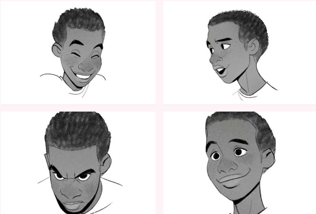
I also was very inspired by the Tangled art book, and the reference photos previously in the term.
Here is the result of this:

I am proud of how they turned out! For having never drawn expressive faces like this before I am very happy with my progress! I found that while creating these faces, that subtle changes made drastic differences to the face. For example, if we look an older image of the happy expression:
Then, if we compare this to a newer version:

As shown above, the differences in how the brows arch and sit on the face change drastically the feel of the expression, and because I want my character to seem very sincere and friendly, the newer version achieved this a lot more successfully.
After I had created these expressions I rested.

References:
Character Design References. 2019. Art Of Spider-Man: Into The Spider-Verse (Part 1). [online] Available at: <https://characterdesignreferences.com/art-of-animation-7/art-of-spider-man-into-the-spider-verse-part-1> [Accessed 16 November 2020].
Kurtti, J., Howard, B., Greno, N. and Lasseter, J., 2010. The Art Of Tangled. San Francisco, Calif.: Chronicle Books LLC, pp.61
17/11/20
GART702
Between the lecture and the workshop, I decided to very quickly do some flat colours on my character expressions in order to sell them more successfully.

I believe that by adding this it really helps to bring her to life and realise her design a lot more strongly!
After the workshop, we had a peer review session! This was to ensure we received a ton of more detailed feedback on our work. Here is the feedback I got!
“Great work Adele. I really like the colour palette, would be nice to see the pastel green(if that’s what it is) a tiny bit more saturated. Great expressions. Presentation could be a bit tidier, but I’m sure you are not done with it yet :)”
“Really nice development in the design and facial expressions for the character. It would be nice to see a turnaround of the character to see her from different angles. and I like the colour scheme you have chosen as it is very eye-catching and stands out well. As for the final piece, I would like to see the character in different poses and angles as well as maybe place the character within an environment so it can give her more place within a world and show her origins as well. Overall I like the process and development work you have done so far.”
“i think you have smashed the look you wanted, the colours work really well together and poses are great with the whole fairy character. there really isnt anything i could that needs improving :)”
“You’ve demonstrated not only a clear aptitude for iterative design but also communicated it very effectively. The character is very creative and really well presented and I think the range of emotion plus the way you’ve incorporated her nature as a fairy into the way she presents those emotions to be very interesting and unique. I’d really like to see more expressions if at all possible, as that would really help in a visual novel and I’d be interested to see what you could do with different lighting passes. Overall very good and hard to flaw, here’s hoping the final piece lives up to expectations.”
“The artwork looks good and well iterated on. The expression look strong and shows the emotions really well. The sad expression body language might need some changes. The arms crossed show more embarrassment then sadness. Otherwise the line art just need some clean up and the characters need another shading pass.”
“I really like your art style its very fitting with your theme. Your poses work well as they express obvious emotion. It would be great to see some of these poses with your different clothing attached to see how the fabrics flow depending on the pose. Your character expressions are great, they show great emotion whilst keeping up with your stylised aesthetic.”
“I love the amount of emotion you’re able to put into the posing and expressions of the character. The clothing reads nicely with some very interesting and original design details that make it stand out, especially in the first design (4D). The color palletes compliment each other nicely and the choice in materials really shine in the first design. The poses really work nicely in conveying the emotions of your character, along with the expressions to go along with it, I feel you’ve really captured her well and shown how human she really is! The only small detail that I would give feedback is on the happy pose. I love the slightly turned back head and I feel it works nicely, however the happy expression seems to not share the same perspective. It would be great if you could see about drawing that expression as it is show perspectively in the poses. Besides that I think you should be very happy with the work and I look forwards to seeing it finish! Good job!”
“Main comment I have is that it looks flat so maybe working on having a grey scale version of the character on a neutral (grey ?) background would really help with getting the final render (volume, shadows, transparence, textures, etc).
Design is lovely and you have a lot of iterations so great work !”
“Great design love the colours and the way you have merged the nature theme within the fabrics and designs of the clothing, particularly that of the fairy designs, the petal style dress and hair combined with the vibrant colours work really well. The expressions are really good and I like how the petals and butterflies change colour or wilt depending on the emotions shown the aura idea could work really well and you could have a look at bioluminescence within nature to help tie that aura glow to nature theme of the character. You could even have this effect seep onto some of the petals of the clothes and onto to the wings of the character as well. Great work.”
“I think that the colour palette is good, especially playing the darker skin values against the lighter tones of the clothing, the only part I dislike is the yellowy green colour – I think this may need to be adjusted to be more in line with the other colours as it’s standing out but for the wrong reasons? Also the fannypack (?) has a slightly different shade of pink and i feel this is clashing with the lighter more pastel pink as its not close enough to feel the same, but also not far enough away to feel different. Perhaps just revisit this slightly.
I really like how the petals change depending on the mood, however, I feel that the expressions could have been explored further and iterated upon more as exploring more subtle facial expressions could have added a bit more depth to the character. I would also look into presenting these in a more professional way, as this will mean that you have less work later on when you’re trying to put all of your stuff together instead of having to put things into professional-looking sheets then.”
I agree with a lot of the feedback I received, especially about neatening up the presentation, which is something I plan to do next when I clean up the lineart of my character! After doing this I will be able to arrange them on a sheet and start visualising my layout a lot clearer.
I do not agree with one comment, however, about creating a turnaround for my character. Due to my character being created for a 2D Visual Novel context there is no need to do this, as the back will never be viewed. This work would be very time-consuming and as it is not necessary for what I hope to achieve, I would rather spend the time making sure my character sprites are as strong as they can be. As I mentioned earlier, moving forward this week I plan to fully clean up the lineart of all three poses ready for next session. I believe that alongside my other work from the GAM module that this is achievable.

18/11/20
GAM701
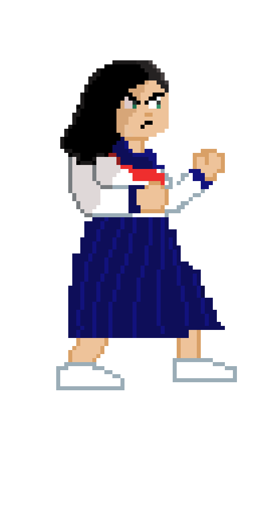
Today I focused fully on creating the main player character for our pixel art game. I found the tutorial below which suggested first blocking out the silhouette of your character.
I did this quickly in the morning in my notebook before going into Aseprite and doing the same with pixels.
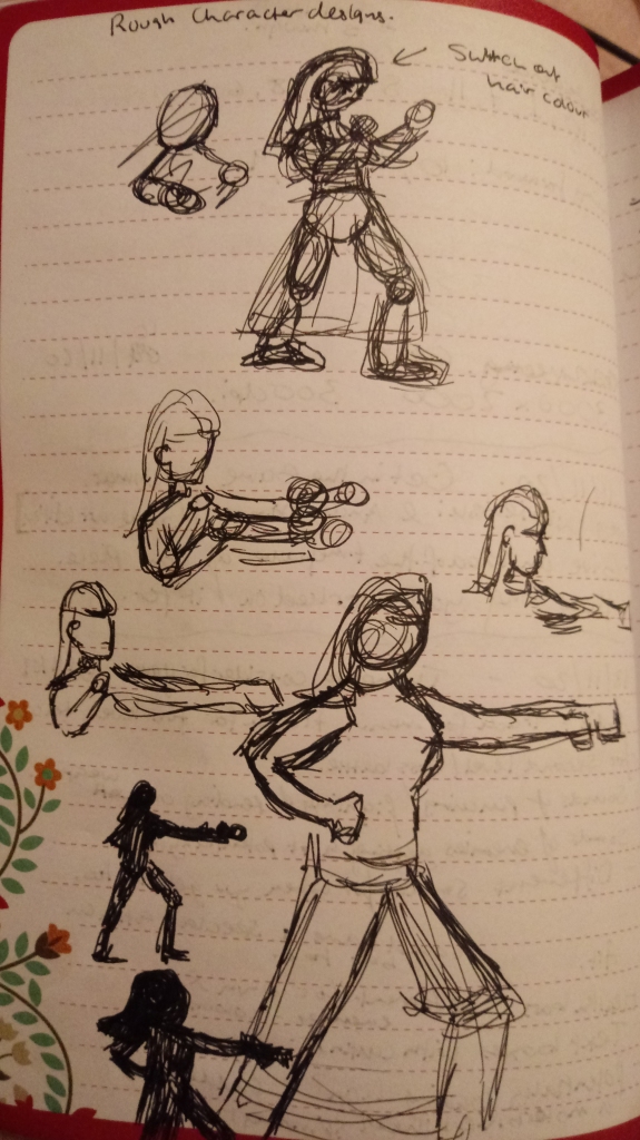
After creating a silhouette I then followed the previously linked tutorial and added in the colours and adjusted the design as needed. Then, once I had a base character done I sent this to the team.
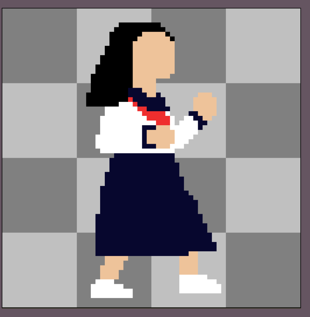
I then progressed on to add further detail and a face to my character. I found that the previous work I had done for GART702 and expressions helped me here! Similarly to that work, it was about conveying emotions using simple lines and the very subtle change that can make a lot of difference. I actually noticed that when adding a face that my sprite was too small, so I scaled it up in order to make sure that the important face details were able to be seen.
This was something I learnt from this tutorial:
These are the changes!
My team loved this! I also showed them a possibility for the design of the 2nd player character.
To save time this would just be change of the colour of hair. My team suggested that the second design potentially having glasses, and I agreed that this would be a nice distinguishing feature without too much extra work! I would have to take care to make her still look tough with glasses on however!
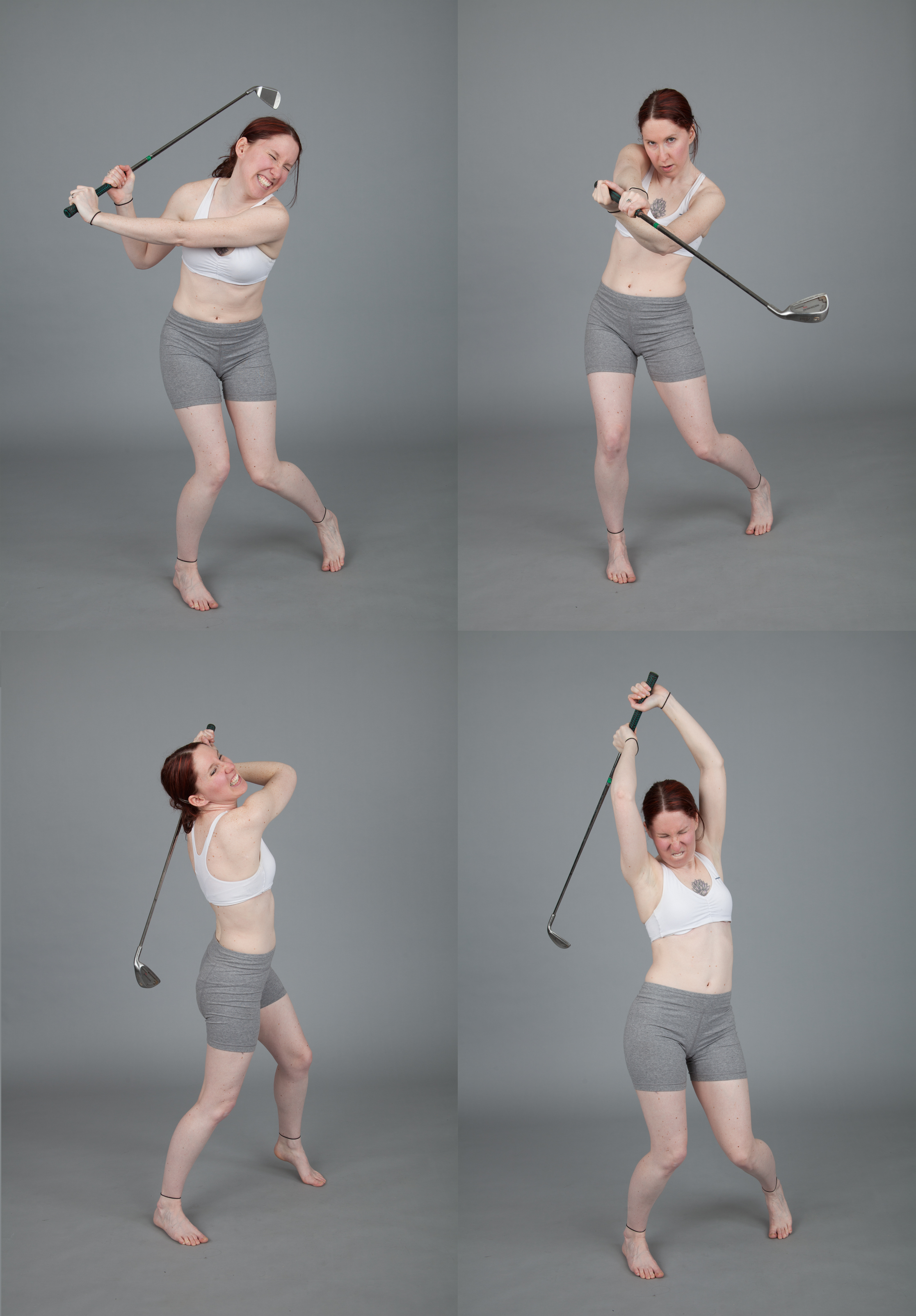
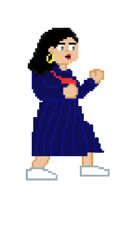
With the team’s approval, I continued on to start creating a simple idle animation for this character. I ensured that I gathered some reference before starting and I took a video of myself moving in the way that I wanted my character to move and also, for future animations, did some punching movements as well as some overhead swings as I plan to have the main character’s ‘ultimate attack’ be an overhead swing down with a bat weapon.
For this animation, I plan to reference not only the video I had recorded but also these images from Senshi Stock.
I re-visited a previous tutorial I had linked earlier to start creating the idle animation.
Here is the first iteration of this:
I was happy with this, but I showed it to my partner who is an animation graduate and they offered some really good critique and advice!
“I would suggest doing a few more frames and aiming for the character to move in a circular motion so they go up and down but also round, but make an emphasis on the up and down movements. And I would try not to move their feet (which tbh would make animating easier) since this is an idle position so if the feet move it may look like they are sliding along the floor. A bit of movement on the feet is fine tho”
I tried out these suggestions and instantly I saw an improvement in the animation! It now had the desired bopping effect that I wanted to achieve.
This is the final result:
I showed the team and they loved it, so I then implemented it into the engine. I was going to use this tutorial I had mentioned in previous posts, but it did not work because my Aseprite was downloaded as a steam game and not from the Aseprite git itself so the file directory was invalid. (Rowe, 2017)
I had never used Unity for 2D work before, let alone sprite animation, so I searched further and I found this tutorial which helped a lot with the process.
After I had successfully implemented the animation I did a little bit more and started a very rough run animation.
Moving forward, I would like to develop all the animations roughly in order to gather an understanding of them while also implementing enough art into the game so that we make progress. This will ensure I do not get caught up in perfecting each animation as afterwards I can always iterate and improve upon them!
After doing this work, I then rested!

References:
Advent1013, 2015. 001 Aseprite Pixelart Character Creation And Basic Animation Walkthrough. Available at: <https://www.youtube.com/watch?v=cL_usZAFB4A> [Accessed 18 November 2020].
MortMort, 2017. What Size To Make Pixelart (Pixelart Tutorial For Beginners). Available at: <https://www.youtube.com/watch?v=AXb-VBZTKDA> [Accessed 17 November 2020].
SenshiStock, 2013. Magical Girl Homura – Pose Reference. [image] Available at: <https://www.deviantart.com/senshistock/art/Magical-Girl-Homura-Pose-Reference-376998995> [Accessed 18 November 2020].
Rowe, E., 2017. Unity Tutorial: Animate Pixel Art using Aseprite and Animation Importer. [Blog] redbluegames.com, Available at: <https://blog.redbluegames.com/unity-tutorial-animate-pixel-art-using-aseprite-and-animation-importer-5c4fe1e06985> [Accessed 6 November 2020].
Chris’Tutorials, 2018. Fireball: Setup For Spritesheet Animation | Unity 2018 Tutorial. Available at: <https://www.youtube.com/watch?v=AMluGldLb0M&> [Accessed 18 November 2020].

19/11/20
GAM701
Today I attended the workshop where we play tested everyone’s games and also gathered feedback for our own game. In the morning, I created a questionnaire for the playtest, focusing the questions mainly on combat as this is what we were focusing on for this demo. However, I also asked about the sprite that I had added so that I could get some feedback on it! We received a lot of feedback during the session and I plan to break down this feedback for the team tomorrow.
After the lecture we agreed to meet tomorrow to discuss the playtest and how we will proceed with the game!
I spent the rest of the evening catching up on blog work! During the lecture today we were advised to create a segment of our blog focusing on Communities of Practice.
Here is what I have written:
Communities of Practice
There are many communities I am interested in, but I believe I most interact with the illustration and webcomic community. I will be inspecting to major platforms for webcomic reading: Naver/Line WEBTOON and Tapas.io.
The tone and language used by members of the community.
With webtoons, there is often discourse between readers and the author of the webcomic. Depending on topic of webcomic and the community which reads it, this can vary very drastically. This also depends on platform too. For example, with the free Line WEBTOON app there is a very large audience that can be reached and because the app keeps a record which webtoons you have read, it is easy to keep track of this and also receive recommendations of other comics of the same genre.
On the other hand, on the Tapas platform, there seems to be a big focus on diverse work and allowing monetisation for creators. I personally have less experience with this platform as I use the website rather than the app, however, I have noticed that a lot of creators have switched over to Tapas from WEBTOON as they enjoy the platform and audience more. This may be due to the nature of their comics being more mature in tone and themes, and the fact that Tapas has a whole mature section that caters to this. When inspecting the difference in the audience for both platforms, this article notes the large difference in audience base. (Harper, 2019)
Notably, they mention the fact that Line WEBTOON is backed by the large South Korean online platform NAVER. This means they have a large capacity for advertisements to gain a larger audience.
Activities and behaviours such as social gatherings and events.
On the WEBTOON app, there are regular reading events that encourage users to read a few chosen comics of an established period to earn coins. This is the in-app currency that can be exchanged to read upcoming chapters not yet released. Additionally, there are also contest ran for creators to win, such as the 2020 Short Story Contest (Short Story Contest Winners, 2020) These events seem very content focused and both the reader and content creator are very concretely set in their named roles.
On the other hand, Tapas.io takes a different approach to events, which are discussed here. (Events | Challenges, n.d.) As evidenced by the fact that these events are discussed in a forum format, there is much bigger community emphasis. By looking at the nature of these events, they also seem more collaborative and creation focused. For example, there are many giveaways alongside art challenges.
Tapas seems to be focused around creating artwork, whereas WEBTOON seems to be focused more on the storytelling aspect.
In terms of social events, I did not discover any events ran by either platforms, however, the success of creators on these platforms has allowed them to gather a fanbase which has then allowed these creators to attend events such as New York Comic Con, as was the case with Fishball on WEBTOON (Fishballishere, 2018)
As for Tapas, there have been discussions of conventions, (Tapastic Convention?, 2016), however nothing seems to have come from this.
The types and modes of interaction.
Both platforms allow creators and readers communicate in the comment section and readers can also give hearts/likes to each chapter. Both apps also have a coin system where readers can unlock future chapters of the comics, but in addition to this, Tapas also offers a way for readers to tip creators with coins. More details of this can be viewed on this webpage (Tapas and Creators, Part 1: What Can Creators Do on Tapas?, 2018)
Additionally, creators can also optionally create paid stories where readers must pay to be able to read the full story. This usually seems to be used by creators of stories that are more mature or explicit in genre. This differs from WEBTOON as to my knowledge, all stories are free.
Another behaviour I have observed on both platforms are Q&A chapters where the creator invites the readers to ask questions in the comment section. The creator then chooses which to answer, usually the most upvoted comments, and creates a chapter centred around this. For example, Heartstopper by Alice Oseman holds annual Q&A chapters. (Oseman, 2020)
These chapters allow the readers to feel more connected to both the creators and the story by giving them some control over the content produced.
Furthermore, Tapas does allow further engagement with readers and creators through the ‘Wall’ feature. Here is an example of Alice Oseman’s Wall. (Oseman, n.d.) This area allows readers to view the creator’s profile and the series’ they have created, liked, and comments they have made. Readers are also able to post comments directly to the creator and view images that the creators have uploaded separately from their comics.
Patterns and rules of the community.
Both platforms have community guidelines that warn against the posting of, both by the creator and the commenter, explicit and offensive content. However, while Tapas allows comments to be deleted by the creator (Wish webtoons let you delete comments, 2019), WEBTOON does not have this feature. This means that the creator is unable to tailor the community they want to create and often are unable to control potential toxicity. This has caused significant issues for some creators, such as ‘@byelacey’ who eventually stopped posting on WEBTOON and moved permanently to Tapas. (Warning: Mentions of Sexual Abuse) (webtoon i am begging you to give creators basic control like deleting comments, 2020)
As mentioned earlier, there is not much of a breach of the ‘creator’ and ‘reader’ roles that both platforms employ, other than for the occasional Q&A session.
Regarding patterns, creators usually display upload schedules for readers to see and this encourages the growth of an audience through consistency. Notably, there are some creators who choose to upload on both platforms, and as it is free to do, it seems to be down to preference of the creator whether or not they do this.

References:
Harper, S., 2019. Webtoon vs. Tapas. [Blog] raptagonstudios.com, Available at: <https://raptagonstudios.com/webtoon-vs-tapas/#:~:text=According%20to%20Similarwebs.com%20Webtoon,better%20features%20for%20the%20creators> [Accessed 19 November 2020].
http://www.webtoons.com, 2020. Short Story Contest Winners. Available at: <https://www.webtoons.com/en/notice/detail?noticeNo=1250> [Accessed 19 November 2020].
Tapas Forum. n.d. Events | Challenges. [online] Available at: <https://forums.tapas.io/c/events-challenges> [Accessed 19 November 2020].
Fishballishere, 2018. N/A. [image] Available at: <https://www.instagram.com/p/BoqU0Eil0ZQ/> [Accessed 19 November 2020].
Tapas Forum. 2016. Tapastic Convention?. [online] Available at: <https://forums.tapas.io/t/tapastic-convention/15043> [Accessed 19 November 2020].
Tapas App, 2018. Tapas and Creators, Part 1: What Can Creators Do on Tapas?. Available at: <https://medium.com/@Tapas_App/tapas-and-creators-part-1-what-can-creators-do-on-tapas-c33f402e0893> [Accessed 19 November 2020].
Oseman, A., 2020. Question Time 2020!. [image] Available at: <https://tapas.io/episode/1979479> [Accessed 19 November 2020].
Oseman, A., n.d. Alice Oseman. [online] Tapas.io. Available at: <https://tapas.io/aliceoseman> [Accessed 19 November 2020].
Tapas Forum. 2019. Wish Webtoons Let You Delete Comments. [online] Available at: <https://forums.tapas.io/t/wish-webtoons-let-you-delete-comments/36017> [Accessed 19 November 2020].
Twitter.com. 2020. Webtoon I Am Begging You To Give Creators Basic Control Like Deleting Comments. [online] Available at: <https://twitter.com/byelacey/status/1279142285251416065?lang=en-gb> [Accessed 19 November 2020].

20/11/20
GAM701
Starting the day, I had a little more to do on my blog so I did this quickly. Then, after this, I had a meeting with my team. We briefly discussed some of the feedback we had received yesterday after the playtest session and ways we will improve our game. Here is a link to the document where the playtest feedback is stored.
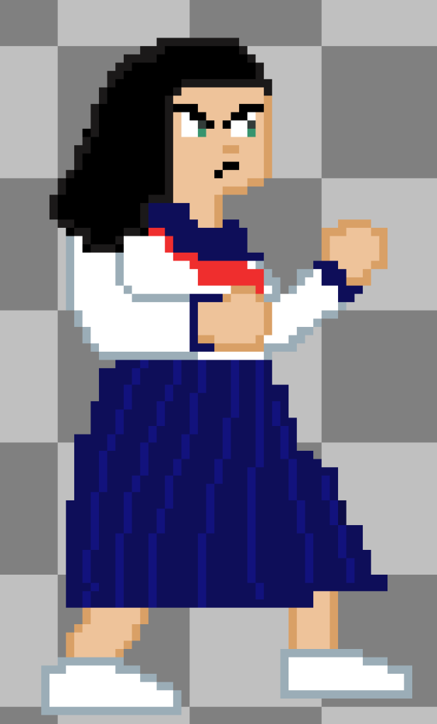
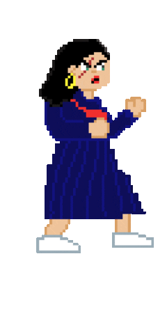
I, in particular, got feedback relating to the character I had created. A few people were reminded a bit too much of Japanese schoolgirl uniforms, or Seifuku, as it is known. This is because Bōsōzoku clothing can be quite similar, and the only big difference is the length of skirt. However, I do agree I could definitely push the toughness of her appearance, especially if she isn’t coming across like that to players.
I discussed this with my team and we came up with solutions like giving her lipstick, earrings, and scars. Indicators that she is more mature and tough. I also had the idea of having blood on her hands and shoes. After the meeting I worked on these changes!
This is the result:
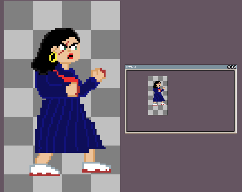
I am really happy with this and I believe it’s a big improvement from the last version! My team agreed, and so I continued on to altering the idle animation to match the new design.

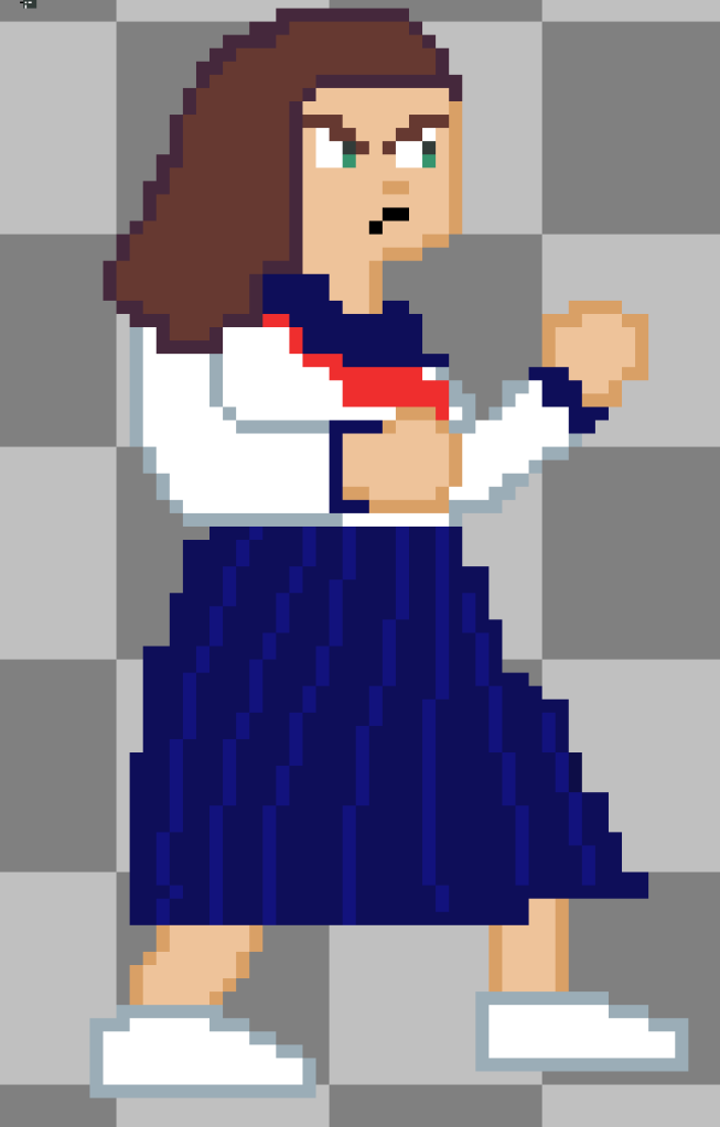
I showed this to the team, and one member, Tom, suggested we have variances to match the plot of our game!

I agreed, and made a more neutral sprite and angrier sprite. These didn’t take too much time at all and turned out really well!
After doing these I rested.

21/11/20-22/11/20
GAM701
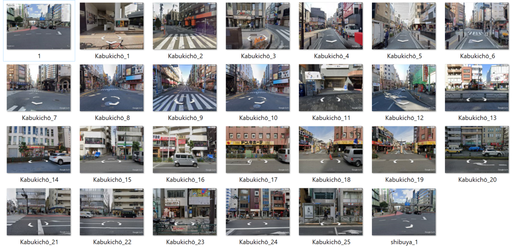
Over the weekend I got the three new idle animations into the game engine and I also gathered some references for backgrounds for the game using Google Earth Pro. I wanted to get more images of storefronts in Tōkyō, and I also researched which areas have big Yakuza and gang activity.
One area that was mentioned is Kabukichō, a red-light district in Tōkyō. I know of this district because the popular SEGA game franchise Yakuza (Ryū ga Gotoku) contains a fictional version of this place and calls it Kamurocho.(Kamurocho, n.d.)
It is a relatively faithful recreation of the real world Kabukichō throughout different time periods. In particular, ‘Yakuza 0’ explores Kabukichō in a 80s setting, and I have noticed that when compared to the other games, elements like pavements and storefronts are quite obviously from the 80s as they are less modern and developed.
This is something I will need to keep in mind when creating backgrounds as our game is intended to be set around this time period. If I have time, I will make sure to reference how the streets looked during that time by inspecting how Yakuza 0 designed the streets.
Here are some images that I gathered from Google Earth of Kabukichō and a few of Shibuya.
GART702
Over the weekend I also intended to start developing cleaner lineart for my character. This is a task that is quite intimidating to me, so I made sure to find some videos which will give some useful tips about how to create successful lineart. I found these to be really useful and reassuring.

References:
Yakuza Wiki. n.d. Kamurocho. [online] Available at: <https://yakuza.fandom.com/wiki/Kamurocho> [Accessed 19 November 2020].
Meppity, 2020. 10 Ways To Make LINEART More INTERESTING. Available at: <https://www.youtube.com/watch?v=aH6p-cTy4KU> [Accessed 22 November 2020].
BaM Animation, 2019. Clean Line Art! Digital Inking Tips. Available at: <https://www.youtube.com/watch?v=NBE-RTFkXDk> [Accessed 22 November 2020].
Brunet, M., 2020. HOW TO DRAW GOOD LINEART (4 Easy Steps). Available at: <https://www.youtube.com/watch?v=ZzgrOMCd380> [Accessed 22 November 2020].

Posts so far:
