The Final Stretch: Rendering, Shading, and Polish.
Weeks 10-12: Polish Period.
The past two weeks have gone by so quickly, and yet I have achieved so much! Because I was in the midst of the final push for this project, I found I did a lot more rapid iterative practical work, and as a result did not spend too much writing down my reflections. So, this post may be a little shorter than the previous one!
After the critique I received previously from Phoebe Herring, mentioned in my last post, I got to work straight away implementing her feedback.
Phoebe’s suggestions, featured in my previous post.
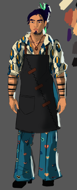
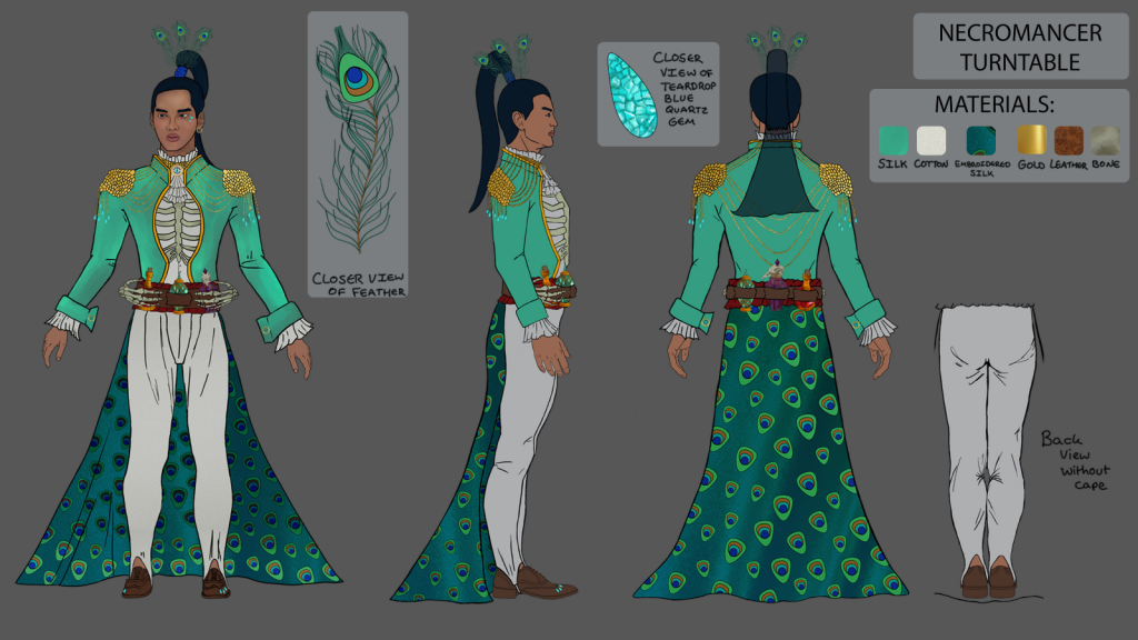
My first step was to complete the other side and back profiles for the turnaround. This was very much a trial-and-error experience with a lot of references!
My Turnaround, roughly sketched in.
I found that once I thought I had finished, I then changed more details on the front pose, meaning these changes had to then be carried onto the other two.
Meanwhile, I wanted to research further into how to properly render my work so that I could achieve Phoebe’s suggested lighting and shading.
I found this incredibly useful video by Marc Brunet which explained the rendering process using Ambient Occlusion in a way that was really accessible to me. In a way, this working from black and white to colour workflow reminds me of the workflow I discussed a previous post, which I was going to work for my environment illustration.
(Brunet, 2020)
One thing I really took from this video was the separation of different stages into categories that would still result in a piece that is publishable online. This was crucial for me during this final push of this project as once I had finished a stage, I felt like I would be able to publish the piece on ArtStation if I ran out of time. Luckily however, I was able to do the full process!
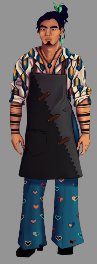
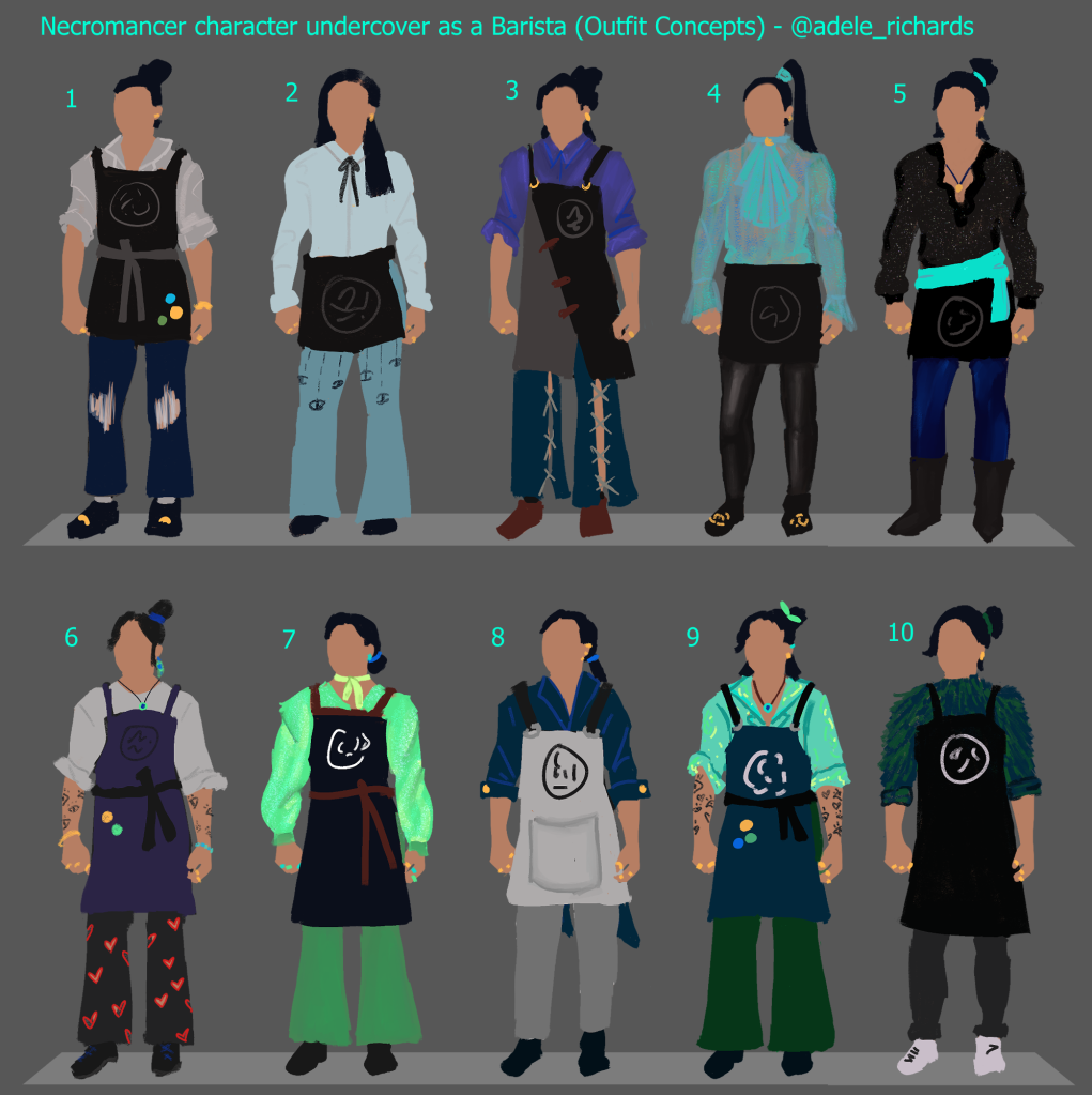
This previously mentioned Marc Brunet video, combined with a lot of critique from friends and lecturers, such as Phoebe once again meant that I was able to take my character from this:
Older version of my rendered character.
To this:
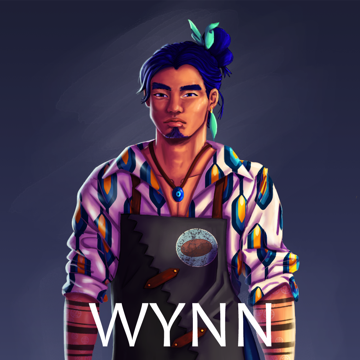
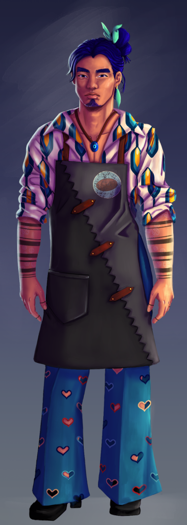
My final version of my character render.
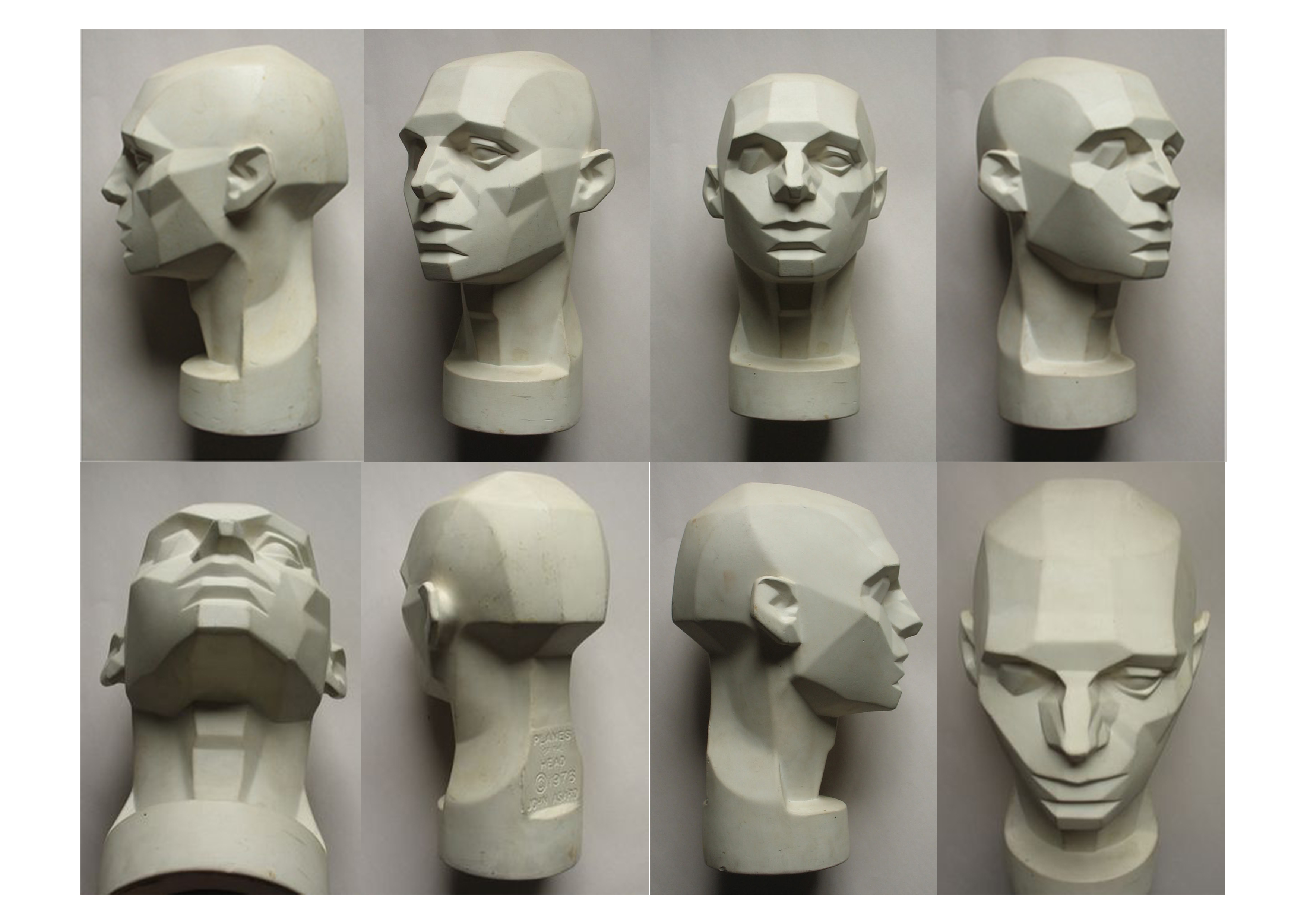
From a follow up session with Phoebe, I learnt about the planes of the face, and maintaining the definition of these in mind while rendering my character. I found this resource after the session and used these references to ensure my character had more dimension to his face.
(Planes of the face, 2017)
In the final days of my project, I paid extra attention to rendering his face, as I wanted this to feel very alive and be a main focal point of his design.
Another workflow that I picked up from a follow up session with Phoebe was using the Face-Aware Liquify tool in Photoshop. This tool allowed me to quickly change key issues with the anatomy of my character’s face, such as his oversized eyes, without disrupting the artwork too much.
The features included in Photoshop’s Face-Aware Liquify tool.
While working hard on the rendering of my character, I realised that I had not incorporated the café logo onto the apron of my character!
I remembered when previously trying to include the logo, the text in the logo became very pixilated and unreadable.
Logo I decided to take forward.
To remedy this issue, I decided to create a simplified version of the logo and add some more narrative to its design! I wanted this simplified version to actually be the older logo that the café used before Wynn took over management and renamed the café ‘Déjà Brew’, referencing his necromancer powers!
This made more sense narratively, as instead of the café being named ‘Déjà Brew’ beforehand and it being a coincidence that Wynn just so happened to find it, he instead branded it after the other side of him. This also once again reiterates that no matter how much he tries to hide from the necromancer side of him, it still creeps through.
In order to communicate the age of the business with the simplified logo, I decided to have the logo printed onto his apron and with age, be cracking and peeling off. To do this, I found references, and found a great website which provided textures to re-create this effect! (Merritt, 2021)
By using these, I was able to very quickly recreate the effect I desired!
Here’s a full speedpaint of the process of the creation of the logo:
After completing this detail, I was focused on completing the rendering and the presentation of my sheets! Then it came to submission! My final project can be viewed on ArtStation here:
I am incredibly happy with the outcome! I believe that although I did scope back drastically from my initial plan with this project, I have created something that clearly shows my increased understanding of the fundamentals of art (anatomy, lighting, perspective etc), which was my original aim with this project!
It was also incredibly satisfying taking an old character and re-vamping his design, and I feel almost as if I have done him more justice!
The previous version of Wynn I created 2 years ago.
The newest version of Wynn!
Thanks for reading this journey!
Make sure to check out the full ArtStation post to see all the sheets I created and some more speedpaints!
For Weeks 6-7, I wanted to experiment with focusing on one workflow fully, rather than switching my attention between lots of smaller little tasks, as this previously left me feeling as if I have under-achieved. I chose to focus on character concepting and turnarounds as this as it is an area I am familiar with, and as such I was hoping that by working on something I am more comfortable with, I will gain motivation and speed up my workflows!
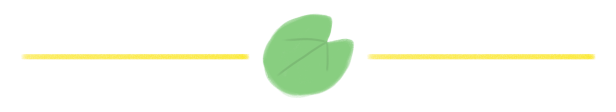
To start off the week, I worked on character silhouettes for turnaround and concepted outfits based on the mood boards I had created previously.
I was really happy with how these came out, and it felt nice to create art I felt confident about. I believe this confidence was due to the fact I have more experience concepting characters than designing environments, and so was able to achieve a result of the quality I wanted quicker.
For the colour scheme of many of these outfits, I took inspiration from the previous design of my character in Necromancer form, based on the Green Peafowl, shown below.
(Richards, 2019)
I sought and received feedback on these designs and narrowed them down to one design that I liked the most – a combination of a few of the outfits which I could take forward.
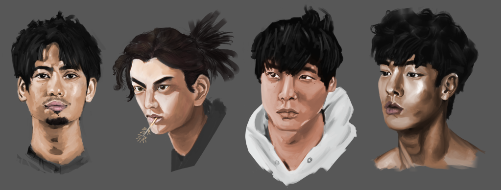
As well as working on the outfits, I wanted to redesign the face of my character, as I was unhappy with its design. I was inspired by this Artstation post by Rose Timperley (2020), who incorporated face studies into her development. I decided to do some face studies of my own and gathered a few references which I felt would work well for what I wanted my character to look like!
Here is the result of that work, and a speed paint showing off my progress:
While creating these faces, I decided to try out the black and white to colour workflow I discussed in my previous post, as I wanted to use this when it came to my environment painting. I found this workflow to be quick and with enough attention to detail and polish, I can see this working well, and being a big time-saver!
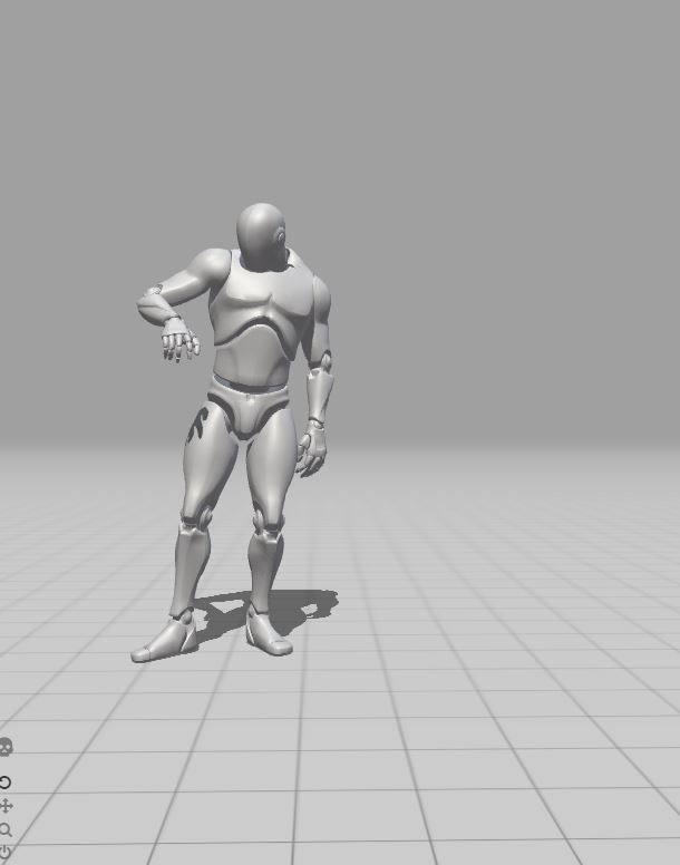
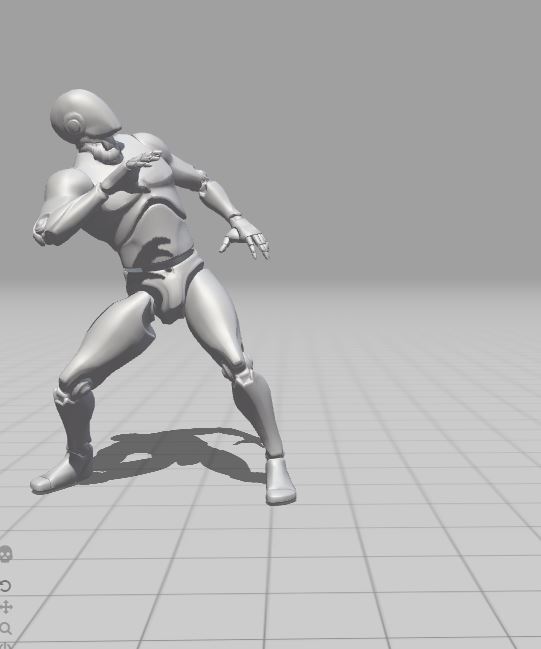
Later, during the week, I had a supervisor lecture, in which I discussed my work further with my supervisor. At his suggestion I investigated using Mixamo to pose the Unreal Player Character to quickly get 3D reference and posing for my environment painting. I found this super useful, and will use this resource in future!
Here are some screenshots of some poses I considered using:
This is the pose for the daytime version of the environment illustration. For this pose, I wanted my character to be interacting with a coffee machine, creating a drink for a customer. The idea behind this pose was to shown his everyday mundane life as a barista in a simple action shot. I envisioned a warm and cozy atmosphere.
This is the pose for the night time version of the environment illustration. For this pose I imagined my character recoiling in horror as his necromantic powers were rebelling and getting the better of him. I imagined the atmosphere to be very supernatural with purples and greens. I wanted there to be a sense of fear and lack of control, a complete contrast to the daytime version of the scene.
As I was quite enthusiastic about my progress character concepting so far, I decided the next week to continue developing this aspect of my project. While researching further into how I could improve my character outfit concepts, I came across this incredible video by Knight Zhang which discusses ways of incorporating more storytelling into your costume design through subjects such as historical context.
(Proko, 2021)
As one of my main design choices when creating my character’s outfits was bellbottom pants, I researched deeper into when they were most in fashion, discovering this was primarily in the 70s. I then discovered the prominence of deep cut collared shirts and more expressive fashion, which was something I was subconsciously already designing for my character!
I decided to really latch onto this idea and create mood boards surrounding the 70s aesthetic!
In particular, I researched into 70s shirt designs and patterns. This is because I wanted to use these patterns to reference his Necromancer form, while also showing off his expressive personality.
To provide more depth to the design decision of dressing my character in 70s clothes, despite him living in the present day, I decided to relate this to his backstory. This idea came from the aforementioned video which discusses deepening a character’s narrative through costume design.
Instead of these clothes being his own, they actually belong to the deceased son of the elderly couple who adopted Wynn after he resurrected that said son momentarily so they could say their final goodbyes.
The shirt pattern concepts I created for my character, based on my mood boards and the original Necromancer design of my character.
As well as deepening my character’s narrative through costume design, I wanted to take the tattoos I had roughly concepted in the outfit concepts and elaborate on these further. I gathered some references to start generating ideas.
I liked the idea of featuring symbology from my character’s original Necromancer form, so I included a lot of eye imagery and feathers into my concepts, relating to the Green Peafowl.
My first iteration on tattoo designs.
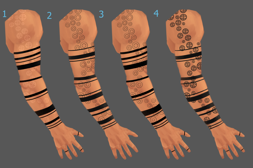
When seeking feedback on these designs, one of my friends pointed out that I hadn’t paid much attention to the way tattoo sleeves usually have a flow to them and a consistent design throughout. I agreed that currently these attributes were missing from my concepts, so I created more iterations!
Second iteration!
With these concepts, I paid more attention to the meaning of tattoos and researched further into techniques and designs that would have more relevance to my character and deepen the meaning of his design. I learnt about the meaning of armband tattoos from this source. (SPOTLIGHT ON ARMBAND TATTOOS AND THEIR MEANINGS, 2018)
With a narrative in mind that I liked, I decided to do one last iteration of the tattoo designs, this time from another angle that would show off the way the tattoos wrap around the arm better, as suggested by my friend.
Third iteration.
I felt these were much more successful and closer to what I had in mind initially. I especially was drawn to the idea of having the evil eye tattoos a different shade to the bands that covered them, in order to more clearly establish the difference in depth and time period between when my character would have had each tattoo.
At a later point I created a rough presentation page which explained my idea behind these tattoos in a clearer way:
Rough presentation sheet for my character’s tattoos including narrative. Not the final version.
The Issue of Scope…
It was around the 8th week of my project where I realised that proposing an overly ambitious project was maybe not my best idea.
Although working on this project so far had pushed me to explore unfamiliar workflows and deepened my skills, it was also quite over-scoped and at this stage of the project, I became overwhelmed with just how much was left to do.
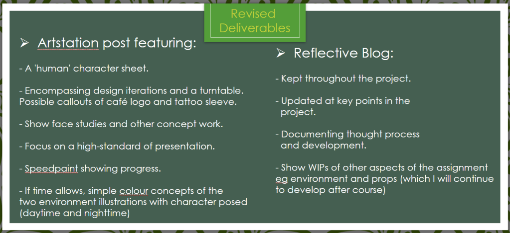
I spoke with my Supervisor and Module Leader and came to the decision that I would focus instead on creating a professionally presented character turnaround with supporting presentation sheets. The below images show the original proposed deliverables for my project, and the re-scoped deliverables.
The original deliverables.
The re-scoped deliverables which I am now working towards.
I chose to focus on creating character sheets as so far during this project this was the area I had made the most progress with, and character concepting is an area I believe I can really display how much I’ve improved upon in my portfolio. After I submit this project, I would like to re-visit the work on the environment illustration that I have done and hopefully in future develop this and create what I originally planned to deliver!
I found that after I made this change my motivation for this project dipped – even though I made a smart decision in rescoping, I felt somehow that I had failed preemptively because I had stopped working on the bulk of my project. However, I was reassured by lecturers that this wouldn’t affect my grade and after time passed, I too began to realise the truth of this.
In reality, I had a much greater chance of improving my skills to an industry standard if I focused on one pipeline/workflow and dedicated the time in needs to really shine!
Another factor that allowed me to regain my confidence was seeking feedback on my work. By getting feedback from peers and other artists, I was able to quickly identify the successful aspects of my work and improve on weaker areas. Having the knowledge of how to improve stopped me from stagnating and getting caught in art block, whilst also improving my own eye to see where I am making mistakes.
One main example of this would be when I was cleaning up the line art on my character turnaround and trying to decide upon the style of 70s shirt I wanted my character to wear. I decided on a silk shirt with an exaggerated big collar and big V dip.
Although I gathered many references, I still found that I was having trouble conveying the lighter-weight silk fabric, and my drawings ended up looking quite heavy.
The original shirt sketch.
I remedied this through the help of the wonderful S.Rodyakin, who posed for me very helpfully! Using these video references, I was able to draw something much more convincing and interesting in terms of shape and silhouette.
The improved shirt illustration!
Now that I had decided to focus on character concepting, it was time for me to really get stuck in and start refining the design of my character. It was around this time when I was able to book a tutorial with one of my lecturer’s Phoebe Herring in order to receive some 1-on-1 critique of my work so far. This was invaluable, as she gave me lots of advice on how to bring my work to a presentable industry standard.
Phoebe assisted me in correcting some of the perspective issues I was having with my posed front-view of my character, as I was struggling with getting the apron to appear three-dimensional, and having the bellbottoms appear to wrap around the leg of my character.
My version.
Phoebe’s paint over.
Using what I learnt from this paint over demo, I will be working to improve from this.
In addition to this, Phoebe also assisted me with my presentation sheets. Previously, I had wanted to relate my presentation sheets to the narrative of my character, so I had chosen to create a chalkboard-esque background to relate to my character’s barista form.
However, my suspicions were confirmed by Phoebe that the background being painterly made it hard to distinguish the background from the foreground of the artwork pieces I was trying to present.
Because the artwork was struggling to become the focal point of the sheets, this meant that the presentation overall was weaker. The main piece of advice I received was to keep it simple, and have the artwork speak for itself!
The final piece of concepting that I did during this period of my project was the logo for the café! I got to work gathering some references!
With the name of the café that my character works at being ‘Déjà Brew’ Café, I wanted to incorporate some circular symbology, relating to the cycle of time/repetitive imagery.
This would also subtly refer to his necromantic powers, as it relates to the death and rebirth cycle. These are the designs that I have created so far, each version being an improvement on the last.
My logos so far!
Currently, I am most happy with the last design on the page. To create this, I ventured from Clip Studio Paint into Adobe Illustrator in order to warp the text in a way that flowed with the circle. I followed this tutorial to get to grips with Illustrator and the warp effect:
(Borchert, 2014)
If I have time in the remaining few weeks I have before my deadline, I would like to improve and iterate on my chosen logo further, perhaps by adding some of the weathered details I incorporated on previous logos!
Moving forwards, I have less than two weeks left before my deadline, so I will be spending this time really getting together my presentation sheets and the three turnaround poses I have planned for my character and aiming to get these to the highest quality possible.
After submission I will be updating this blog with my final reflection!
Borchert, M., 2014. How to Create a Wave Effect on Type in Adobe Illustrator Tutorial. Available at: <https://youtu.be/g2PcPLwKVJk> [Accessed 6 August 2021].
Developing an Environment for My Necromancer Character
Weeks 1-6: Research Period
Beginning my Final Project for my Master’s Year, I knew I wanted to use this final term to create a project individually and tackle a subject area I knew I needed to improve on. One which I felt was missing from my portfolio currently.
Due to the time constraints this project would pose, and the support that I would have access to from lecturers and other staff, I thought this final term would be the perfect time to try out a project further out of my comfort zone!
Having access to frequent supervision sessions on my course will also push me to achieve and hold me accountable!
My aim for this term is to strengthen my 2D Art skills, and demonstrate my improved understanding of the key art fundamentals, such as lighting, composition etc. Another main aim of this project is to increase my employability as a 2D Concept and Visual Development Artist.
During Week 1, I detailed to my supervisor three main ideas I had for my project, all of which were targeting areas I felt weren’t currently visible in my portfolio, as mentioned earlier.
Human version – normal clothes, coffee shop setting, most likely behind the counter serving.
Necromancer version – same location but at evening/night – dramatic lighting with potions replacing normal items.
Ethical issue in that this character is based on Myanmar and there are currently protests and a coup.
Would be meeting the job requirements I mentioned earlier.
Would show character design from this initial concept to a more ‘human’ version of this character and also prop breakdowns and concepts.
Would be nice to present this piece as a slide between the two outcomes/a gif showing the progress between them, similar to my Rookies 2021 Submission: Thabisa (Richards, 2021)
Idea 3.
Create a visual novel entirely by myself – most likely experimental and a vertical slice due to time constraints.
Would involve coming up with an initial concept, script writing, python programming and art creation (background, characters, UI).
Could investigate time-saving techniques etc. Use 3D to model backgrounds etc
Would be using Ren’Py.
Inspiration from Brianna Lei, creator of ‘Butterfly Soup’, created by herself. (Lei, 2017)
Assignment submitted as an itch page, and Artstation page – Want to create one to have a game I am proud of on my portfolio.
Ethical concerns would depend on what I base my visual novel around – any topics that arise etc.
Risky as art will not be as polished and there’s a high chance that it may be overscoped, but there’s a lot to be marked on!
Risky with mechanics too, and being unique enough with this concept to make it engaging to the player.
After discussing these ideas, I decided upon Idea 2 – the re-creation of my Necromancer character, and put him into an environment. By choosing a pre-made character, I will speed up some of the concepting time as I have a design to work from. Additionally, I am hoping that by taking a character already existing and improving them, I will be able to demonstrate to an employer that I have improved and expanded upon a concept.
As I will be embarking on an individual project, it is up to me to keep up my project on track, and this can influence motivation. To tackle this issue, I created a timeline for my project early on, with rough aims for each period of the project.
I split my project into four segments: Research, Practical, Polish, and Finalise.
In order to keep myself on track outside of lecturer contact time, I decided to create a Trello board for myself, in Kanban style. This is because I believe that using Kanban, over a full scrum development style, will allow me to be more flexible during my project. This will allow me to focus on tasks I find more enjoyable or understand the workflow of more clearly, meaning my productivity will be heightened and I will hopefully experience less artistic blockers.
In my Trello board, I used colour coordination to indicate the importance of tasks. For example, red indicates high importance, whereas green is low importance. Additionally, I used time deadlines in order to push myself to keep on track, rather than having tasks open-ended. As is shown in the above image, a lot of tasks are due to be completed on the same date, usually when a new week begins. This is to allow myself a little bit of flexibility during the project.
As mentioned previously, the first six weeks of my project was dedicated to the ‘Research’ phase. This firstly involved a lot of organisation of the project. To begin, I created a smart plan for the presentation I would have to give in the fourth week of this project. By creating this early in the project, I had a clear vision of what I needed to create, which also aided in my creation of tasks on the Trello board.
Image of my SMART plan for this project.
After creating this, I began to collect a lot of visual reference for my art style inspiration, the café interior, props, and possible outfits for my Necromancer character in his undercover barista form. In these mood boards I noted down what I liked about each image I had created, and although this was very time-consuming, it also helped to focus in on what exactly I wanted to achieve and create in my work.
All references of images on the moodboards, can be found in a description next to the image!
Below are the mood boards I created:
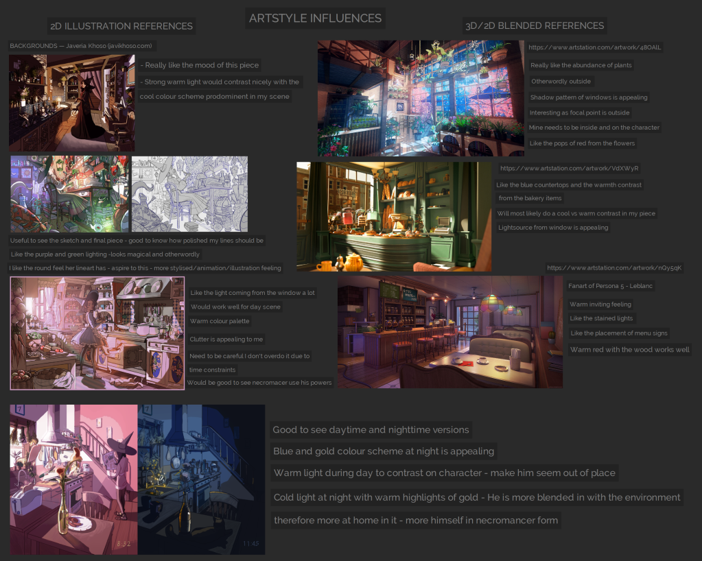
ART STYLE INSPIRATION MOODBOARDS
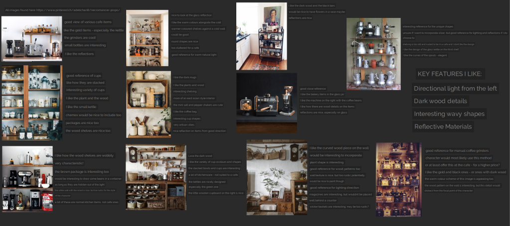
PROP MOODBOARDS
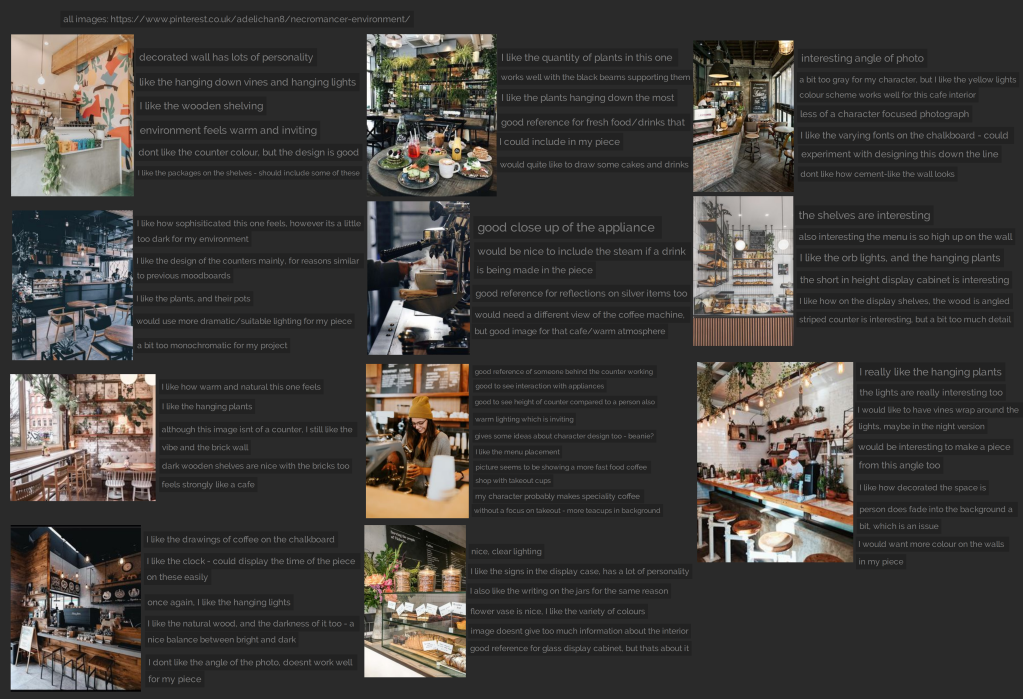
ENVIRONMENT MOODBOARDS
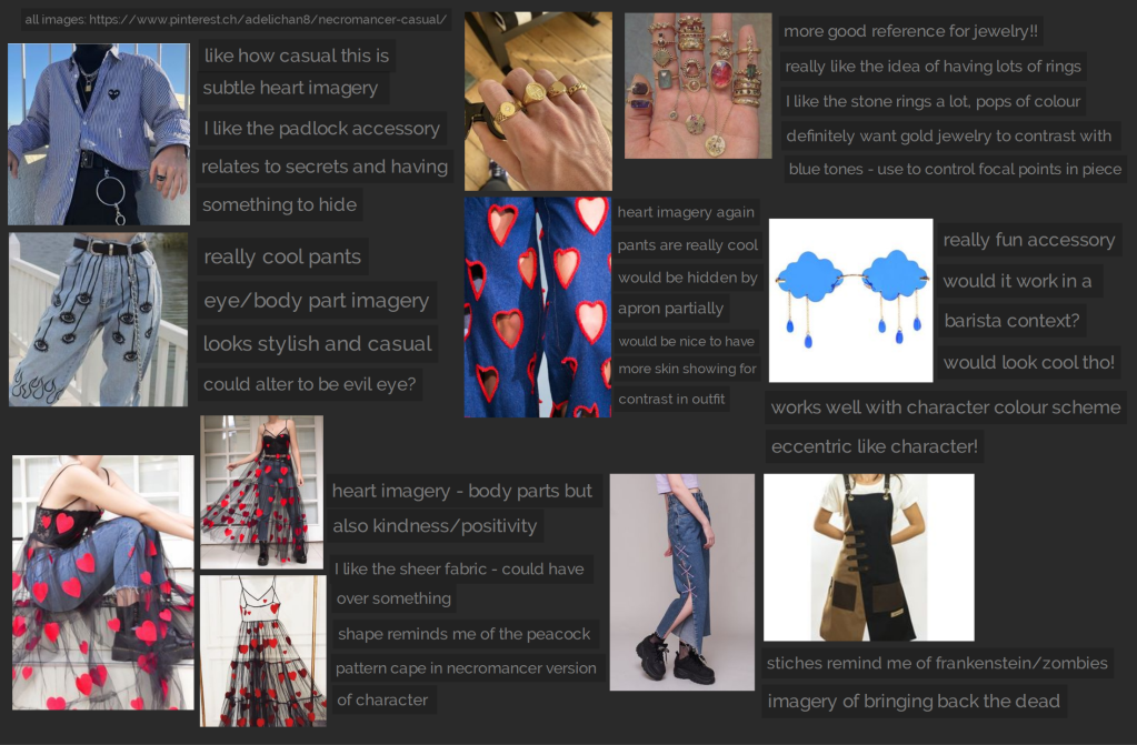
OUTFIT MOODBOARDS
PRESENTATION SHEETS MOODBOARD
While creating my project, as part of the requirements for the assignment, I had to consider the ethical concerns.
One issue with my Necromancer character, is my initial inspirations I had to when first creating this character. Initially, my character was inspired by Green Peafowl from Myanmar. I decided that this character would be a Necromancer, as his original concept was centred around taking an animal and a DnD class and combining them. Peacocks are commonly seen as a symbol of rebirth and renewal, which links them to the theme of Necromancer.
However, currently Myanmar is undergoing a coup and there have been hundreds of deaths. By taking a character from an Asian country currently undergoing so much violence, and then associating that character with death, as a White person this feels incredibly distasteful. As a result, I decided that my piece would not have any graphic depictions of gore, death, or other sensitive material. I have also decided to separate him from reality as much as possible, only focusing on the visual similarities between the green peafowl, whilst still maintaining his appearance as an Asian character.
I additionally decided to change the narrative of my character, rather than him being evil or having any negative connotations in relation to death, he instead is cursed with these powers, and chooses to try to control them and use them for good, never using them to harm anybody.
In order to flesh out my character’s story I created a character biography during this research phase, this can be found here:
By creating this, I was able to identify some of his interests, and then think about which props or interior design decisions I could make to reflect this.
Speaking of interior design, I decided that this would be a relevant workflow avenue to research. I found two talks on GDC by Dan Cox which discusses Interior Design and how it can be used to influence Game Design.
Although these talks were more focused on 3D spaces and game levels, I still learnt about some interesting ways interior designers use contrast and repetition etc. I will be keeping these in mind and re-visiting this information when refining my environment.
As well as this, I strengthened my knowledge around environmental thumbnailing. I found a tutorial on YouTube by illustrator Lee White, and his process on creating thumbnails.
(YouTube, 2019)
I could relate this to my own work and found it very useful.
I felt particularly reassured to see that he started off with very rough sketchy thumbnails and then worked these up to more solid drawings. As someone who is not familiar with environment concepting, as much as character concepting, this gave me hope that even though my initial sketches may not be perfect, this is okay, and that I should not be discouraged but instead push the ones that are working the further.
Encouraged by this video, I began creating rough sketches of the composition of my environment.
After narrowing down the composition I liked the most, I researched more into tonal thumbnails, and found an interesting tutorial by Trent Kaniuga:
(YouTube, 2017)
After watching this, I created a tonal version of the thumbnail I felt was most successful, and through doing this I was able to understand more clearly the depth of the image and the positioning of some props.
However, I knew I had to improve on this composition, as it is very basic. Additionally, I will need to focus more on prop design before I can concretely know where to position some props, and really refine the illustration.
In order to make the composition more interesting, without worrying too much about perspective, I decided to use Maya and 3D model some of the environment in order to establish more interesting camera angles.
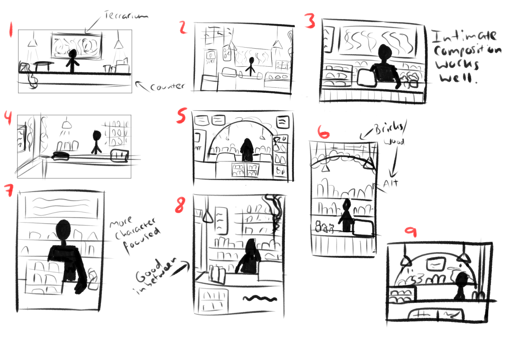
After taking a few screenshots of the rough blockout at different camera angles I put them together in a document and asked for feedback from a friend.
I received help, and I was able to enhance the 2nd thumbnail into something a lot more interesting and closer to the atmosphere I wanted to create for this piece!
I will develop this further moving onto the next phase of my project: the Practical phase.
WHAT WORKED WELL THIS PHASE
In depth research means I have a detailed pool of references to draw from.
2. Because I defined my narrative and created a timeline early on, I have a clear idea what I should be doing at each stage, meaning I am not aimlessly creating, for the most part.
HOW TO IMPROVE MOVING FORWARD
Focus in on a workflow for a longer period, rather than flitting between tasks: higher chance of developing something more fleshed out and therefore I will feel more motivated.
(Although the flexibility of choosing what I want to work on was nice and kept me interested in my work, I began to feel demotivated as the weeks went on as it felt I wasn’t creating anything I could show off or be proud of as the quality wasn’t up to my standard just yet.)
2. Might be better to research workflows as I am creating – can put it into practice straight away rather than re-visiting.
Thank you for reading and keep tuned for another update at the end of the practical phase, where I’ll be showing off a lot more of the art I’ve done for this project! You can check out the Pitch Presentation I did for this project in Week 4 here:
This video shows a black to white workflow that I would like to try out further down the line when developing my environment piece! There were many other videos I watched that inspired me during these past six weeks, but I will mention these once they become more relevant in future blog updates!