
Re-Scoping, Motivation and Turnarounds.

Weeks 6-10: Practical Period.
To catch up, make sure to read my previous post!
For Weeks 6-7, I wanted to experiment with focusing on one workflow fully, rather than switching my attention between lots of smaller little tasks, as this previously left me feeling as if I have under-achieved. I chose to focus on character concepting and turnarounds as this as it is an area I am familiar with, and as such I was hoping that by working on something I am more comfortable with, I will gain motivation and speed up my workflows!
To start off the week, I worked on character silhouettes for turnaround and concepted outfits based on the mood boards I had created previously.
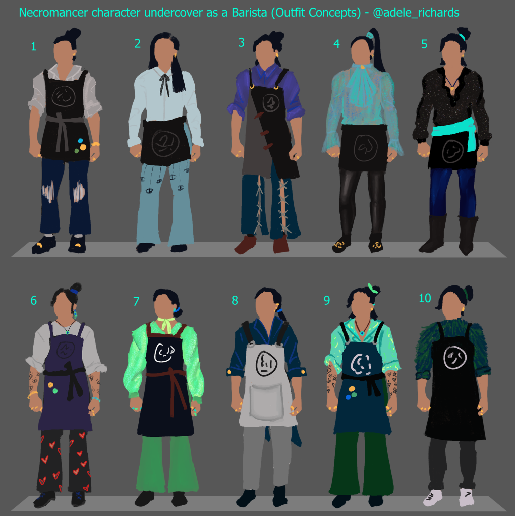
I was really happy with how these came out, and it felt nice to create art I felt confident about. I believe this confidence was due to the fact I have more experience concepting characters than designing environments, and so was able to achieve a result of the quality I wanted quicker.
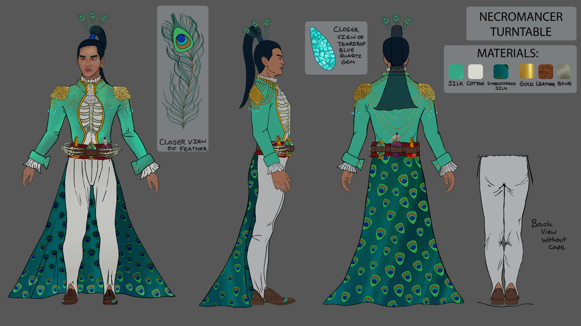
For the colour scheme of many of these outfits, I took inspiration from the previous design of my character in Necromancer form, based on the Green Peafowl, shown below.
I sought and received feedback on these designs and narrowed them down to one design that I liked the most – a combination of a few of the outfits which I could take forward.


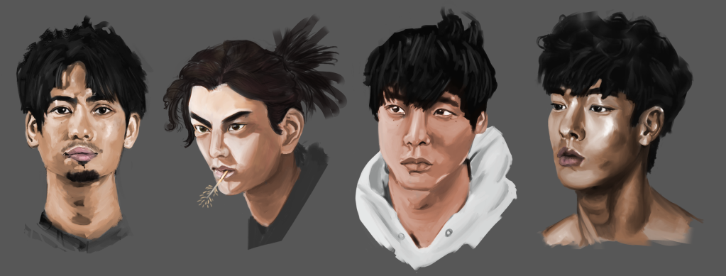
As well as working on the outfits, I wanted to redesign the face of my character, as I was unhappy with its design. I was inspired by this Artstation post by Rose Timperley (2020), who incorporated face studies into her development. I decided to do some face studies of my own and gathered a few references which I felt would work well for what I wanted my character to look like!
Here is the result of that work, and a speed paint showing off my progress:

While creating these faces, I decided to try out the black and white to colour workflow I discussed in my previous post, as I wanted to use this when it came to my environment painting. I found this workflow to be quick and with enough attention to detail and polish, I can see this working well, and being a big time-saver!
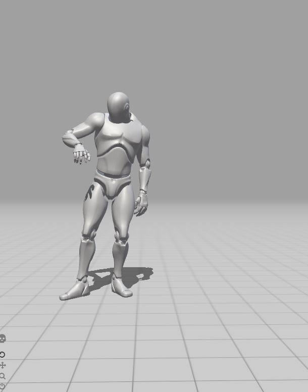
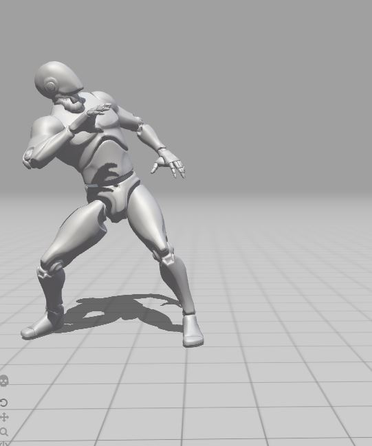
Later, during the week, I had a supervisor lecture, in which I discussed my work further with my supervisor. At his suggestion I investigated using Mixamo to pose the Unreal Player Character to quickly get 3D reference and posing for my environment painting. I found this super useful, and will use this resource in future!
Here are some screenshots of some poses I considered using:
As I was quite enthusiastic about my progress character concepting so far, I decided the next week to continue developing this aspect of my project. While researching further into how I could improve my character outfit concepts, I came across this incredible video by Knight Zhang which discusses ways of incorporating more storytelling into your costume design through subjects such as historical context.
As one of my main design choices when creating my character’s outfits was bellbottom pants, I researched deeper into when they were most in fashion, discovering this was primarily in the 70s. I then discovered the prominence of deep cut collared shirts and more expressive fashion, which was something I was subconsciously already designing for my character!
I decided to really latch onto this idea and create mood boards surrounding the 70s aesthetic!


To provide more depth to the design decision of dressing my character in 70s clothes, despite him living in the present day, I decided to relate this to his backstory. This idea came from the aforementioned video which discusses deepening a character’s narrative through costume design.
Instead of these clothes being his own, they actually belong to the deceased son of the elderly couple who adopted Wynn after he resurrected that said son momentarily so they could say their final goodbyes.


As well as deepening my character’s narrative through costume design, I wanted to take the tattoos I had roughly concepted in the outfit concepts and elaborate on these further. I gathered some references to start generating ideas.

I liked the idea of featuring symbology from my character’s original Necromancer form, so I included a lot of eye imagery and feathers into my concepts, relating to the Green Peafowl.

When seeking feedback on these designs, one of my friends pointed out that I hadn’t paid much attention to the way tattoo sleeves usually have a flow to them and a consistent design throughout. I agreed that currently these attributes were missing from my concepts, so I created more iterations!

With these concepts, I paid more attention to the meaning of tattoos and researched further into techniques and designs that would have more relevance to my character and deepen the meaning of his design. I learnt about the meaning of armband tattoos from this source. (SPOTLIGHT ON ARMBAND TATTOOS AND THEIR MEANINGS, 2018)
With a narrative in mind that I liked, I decided to do one last iteration of the tattoo designs, this time from another angle that would show off the way the tattoos wrap around the arm better, as suggested by my friend.
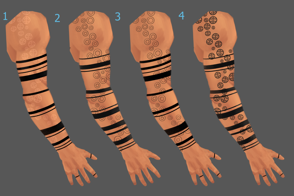
I felt these were much more successful and closer to what I had in mind initially. I especially was drawn to the idea of having the evil eye tattoos a different shade to the bands that covered them, in order to more clearly establish the difference in depth and time period between when my character would have had each tattoo.
At a later point I created a rough presentation page which explained my idea behind these tattoos in a clearer way:


The Issue of Scope…
It was around the 8th week of my project where I realised that proposing an overly ambitious project was maybe not my best idea.
Although working on this project so far had pushed me to explore unfamiliar workflows and deepened my skills, it was also quite over-scoped and at this stage of the project, I became overwhelmed with just how much was left to do.
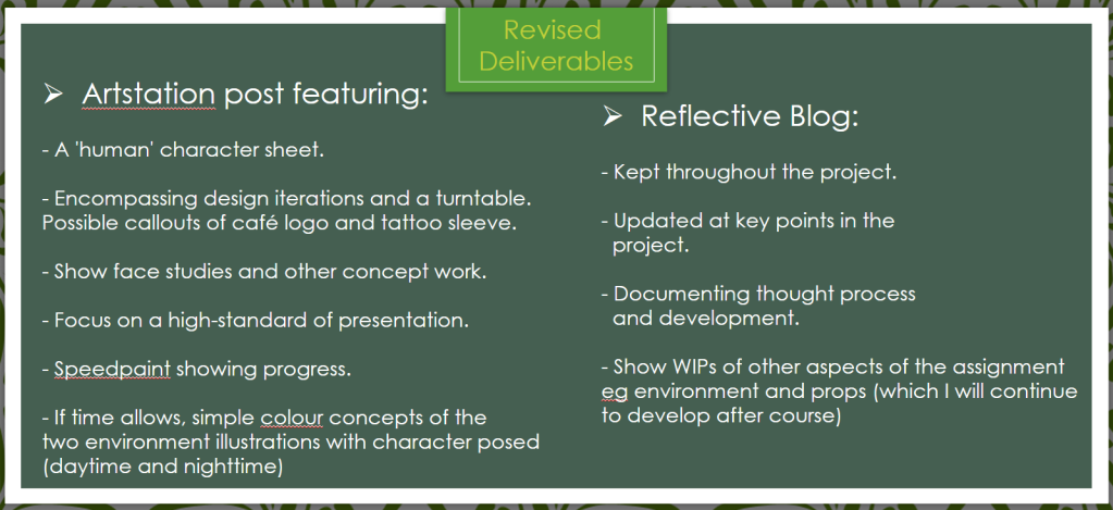
I spoke with my Supervisor and Module Leader and came to the decision that I would focus instead on creating a professionally presented character turnaround with supporting presentation sheets. The below images show the original proposed deliverables for my project, and the re-scoped deliverables.

I chose to focus on creating character sheets as so far during this project this was the area I had made the most progress with, and character concepting is an area I believe I can really display how much I’ve improved upon in my portfolio. After I submit this project, I would like to re-visit the work on the environment illustration that I have done and hopefully in future develop this and create what I originally planned to deliver!
I found that after I made this change my motivation for this project dipped – even though I made a smart decision in rescoping, I felt somehow that I had failed preemptively because I had stopped working on the bulk of my project. However, I was reassured by lecturers that this wouldn’t affect my grade and after time passed, I too began to realise the truth of this.
In reality, I had a much greater chance of improving my skills to an industry standard if I focused on one pipeline/workflow and dedicated the time in needs to really shine!
Another factor that allowed me to regain my confidence was seeking feedback on my work. By getting feedback from peers and other artists, I was able to quickly identify the successful aspects of my work and improve on weaker areas. Having the knowledge of how to improve stopped me from stagnating and getting caught in art block, whilst also improving my own eye to see where I am making mistakes.
One main example of this would be when I was cleaning up the line art on my character turnaround and trying to decide upon the style of 70s shirt I wanted my character to wear. I decided on a silk shirt with an exaggerated big collar and big V dip.
Although I gathered many references, I still found that I was having trouble conveying the lighter-weight silk fabric, and my drawings ended up looking quite heavy.

I remedied this through the help of the wonderful S.Rodyakin, who posed for me very helpfully! Using these video references, I was able to draw something much more convincing and interesting in terms of shape and silhouette.

Now that I had decided to focus on character concepting, it was time for me to really get stuck in and start refining the design of my character. It was around this time when I was able to book a tutorial with one of my lecturer’s Phoebe Herring in order to receive some 1-on-1 critique of my work so far. This was invaluable, as she gave me lots of advice on how to bring my work to a presentable industry standard.
Phoebe assisted me in correcting some of the perspective issues I was having with my posed front-view of my character, as I was struggling with getting the apron to appear three-dimensional, and having the bellbottoms appear to wrap around the leg of my character.


Using what I learnt from this paint over demo, I will be working to improve from this.
In addition to this, Phoebe also assisted me with my presentation sheets. Previously, I had wanted to relate my presentation sheets to the narrative of my character, so I had chosen to create a chalkboard-esque background to relate to my character’s barista form.
However, my suspicions were confirmed by Phoebe that the background being painterly made it hard to distinguish the background from the foreground of the artwork pieces I was trying to present.
Because the artwork was struggling to become the focal point of the sheets, this meant that the presentation overall was weaker. The main piece of advice I received was to keep it simple, and have the artwork speak for itself!
The final piece of concepting that I did during this period of my project was the logo for the café! I got to work gathering some references!

With the name of the café that my character works at being ‘Déjà Brew’ Café, I wanted to incorporate some circular symbology, relating to the cycle of time/repetitive imagery.
This would also subtly refer to his necromantic powers, as it relates to the death and rebirth cycle. These are the designs that I have created so far, each version being an improvement on the last.

Currently, I am most happy with the last design on the page. To create this, I ventured from Clip Studio Paint into Adobe Illustrator in order to warp the text in a way that flowed with the circle. I followed this tutorial to get to grips with Illustrator and the warp effect:
If I have time in the remaining few weeks I have before my deadline, I would like to improve and iterate on my chosen logo further, perhaps by adding some of the weathered details I incorporated on previous logos!
Moving forwards, I have less than two weeks left before my deadline, so I will be spending this time really getting together my presentation sheets and the three turnaround poses I have planned for my character and aiming to get these to the highest quality possible.
After submission I will be updating this blog with my final reflection!
REFERENCES:
Adele Richards, 2019. Necromancer Concept. [image] Available at: <https://www.artstation.com/artwork/58GxqW>.
Timperley, R., 2020. Oleander – Character Design Sheet. [image] Available at: <https://www.artstation.com/artwork/d8828K> [Accessed 10 July 2021].
Proko, 2021. Level Up Your Character Design with Knight Zhang. Available at: <https://www.youtube.com/watch?v=CjiKlLE3NuI> [Accessed 19 July 2021].
EASY INK, 2018. SPOTLIGHT ON ARMBAND TATTOOS AND THEIR MEANINGS. Available at: <https://easy.ink/blogs/temporary-tattoos/armband-tattoos-and-their-meanings> [Accessed 21 July 2021].
Borchert, M., 2014. How to Create a Wave Effect on Type in Adobe Illustrator Tutorial. Available at: <https://youtu.be/g2PcPLwKVJk> [Accessed 6 August 2021].
